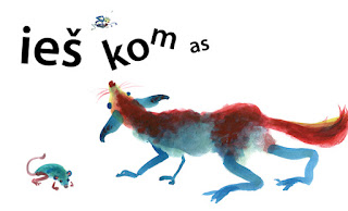
These past two weeks, after coming back from Bologna, I was working on my BA project non-stop. I played with my rough compositions and tried to integrate the text as a character. I'm using InDesign again for this project as I did in my previous collaborative book.
During the ninth week I was in a bit of a standstill and unsure what to do with the text in my book. I simply made it static and monotonic only to see that it wouldn't work for my story. This explains why I didn't show any progress last week - there was hardly any at all! Luckily, I regained my confidence after getting some good critique and advice last week. I realized once again that the text had to play an important role and interact with other characters. How else can the author express his emotions if he's not visible anywhere in the book? This is not an ordinary book after all!
I chose a sans serif typeface as I liked its solid contrast compared with my painterly characters. It's going to be black against the plain white background throughout all the book. I think this solution follows my main goal of simplicity quite well. However, it's easier said than done and so hard to achieve good results. The best examples of such books I found are either Asian or created by designers using simple colours and shapes.
This week I'll keep working on my story as it needs further development. I'll also print some original size sample spreads and choose the paper I like. By next week my project should be 75% finished and my story well developed and convincing. I still don't have a decent ending to my story so I'm ready for something unpredictable. That's how it works with the creative process. Embrace uncertainty and improvise! It's one of a kind project for me, where the story is driven by random characters and thoughts instead of an obvious main character and a clear plot. I'm glad I took this challenge, but now I have to make it a proper book with the beginning, the middle and the end!
Here are the first five spreads from my book. You'll see more next week!
Monday, 15 April 2013
Sunday, 7 April 2013
Bologna Children's Book Fair 2013
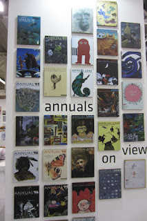
Last week I spent four days in Bologna Children's Book Fair, which was celebrating its 50th anniversary. This was my first visit and it really was a one of a kind experience with thousands of children's books from different countries and a whole spectrum of publishers. Some of them had very long queues of young illustrators waiting to show their portfolios. Others, such as Topipittori and Corraini, were always crowded, so it was quite hard to look through their books. I really enjoyed the Illustrators exhibition with 385 beautiful illustrations. The guest of honour this year was Sweden and there were lots of Swedish books and contemporary illustrations on display. Below you can find my small selection of photos from this huge international fair.
Display of the best publishers of the year
Illustrators exhibition
Contemporary Swedish illustration
A glimpse at the events the fair offered this year
A long wall for ads and self-promotion
Subscribe to:
Comments (Atom)


