 I'm looking for the balance between thinking and feeling in my creative process. How to make things look simple from the outside but complex inside? That's what makes children's books so fascinating! There's always something new to discover when you read them again. That's why most these books don't have a strict audience and could be read both by kids and adults. Some of the greatest picture books actually deal with difficult subject matter such as migration or alienation in the books by Shaun Tan. His essay "PICTURE BOOKS: Who Are They For?" is very thought-provoking.
Never ignore your feelings as they are what drives us to create crazy things and we don't even ask ourselves why or to whom we are doing it. We simply enjoy the process, just like kids do when they are creating. However, we are thinking creatures and thinking is inevitable. Too much of something and the balance is lost. I recall an idea about the "synthesis of form and content" in art expressed by the great American designer Paul Rand. Both form and content are important and should be fused indistinguishably. What a great challenge, indeed!
Last week I discovered another inspiring children's book illustrator Kevin Waldron. His characters struck me with their simplicity and sincerity, just like those of André François, Květa Pacovská or Oliver Jeffers. He created an interesting illustration of letter M for "The Small Print" Illustrated Alphabet project. It inspired me to base my BA project on the Lithuanian alphabet (it'll be written in my native language).
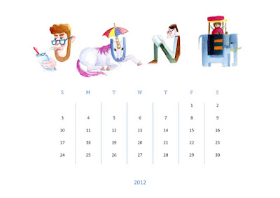
I've already tried illustrating an alphabet during my Erasmus exchange studies at Norwich University of the Arts in the UK, 2012. It was an optional independent project during the grading process and the alphabet was meant to be functional. I did it in one week after doing some research. It was my first attempt and the results were not very satisfying, but it was fun to create all the weird characters.
Illustrated alphabet created at NUA
 |
| You can see in here that the characters were based on words |
 |
The letters were
easier to read in words (back then NUA was NUCA)
|
 |
| Tried using some in a calendar as well |
Original-size spreads from my alphabet storyboard. For something this small, I draw with a pencil
Accidentally inverted these three spreads, but I quite liked this effect...

The audience of my book is another issue I have to deal with. So instead of making my book educational and limited to only small kids, I'll try to expand my audience by being more flexible than with the alphabet project during my exchange studies. Stop describing and explaining things and instead let your creativity flow! Children are very clever and want to figure everything out by themselves. It's like a game for them to understand a good picture book and it's also a big game for the artist who creates such books. Probably the best advice I can give anyone is just BE A KID, curious, playful and sincere.
I've also been reading a great book about gesture drawing with the notes of Walt Stanchfield. These notes were aimed at Disney animators, but I find them very inspiring and well explained. It emphasizes the importance of conveying strong feelings through simplicity, which is exactly what I'm trying to achieve. However, I need to draw loads of characters and poses to get any good at it. Back to work or should I say playing instead?


No comments:
Post a Comment